When Laura reached out for branding for a new local brand for the gymanstic girlies on Island, I was excited to breathe life into FAE.
We had so much fun playing with fonts, icons, elements and colours before we came to the final logo. The simple “flick” mimics a gymnast in motion, but the remainder of the logo is for strength, stability and form. Showcasing the brand as a solid name to look out for in the market.
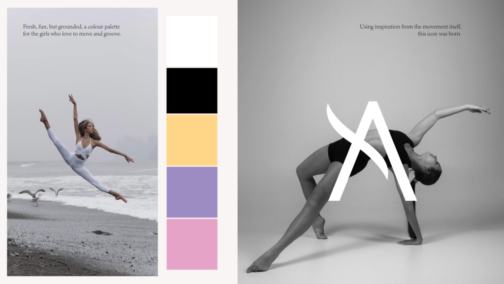
We opted at keeping the crux of the brand as black and white – but we did want to add some colours to bring the feminine, fun edge to the business.